
We live in an era where massive amounts of data collected by satellites, weather stations, ocean buoys, and other sensors is freely available to everyone. This includes atmospheric measurements, temperature, humidity, rainfall, sea surface temperature, wave height, and countless other parameters. By analyzing this raw data, we can gain valuable insights into our planet’s condition and processes. These insights allow us to make better decisions and create a better future.
But before any of that, we first need to learn how to analyze. Extracting insights from these large datasets is a very involved process. Traditionally, you would install a large, often expensive, GIS software package. Then you would need to learn to navigate a complex interface, searching for the right tools hidden in layers of menus.
In this article, we are going to try a simpler approach. We are going to use Python – a programming language – to process the dataset.
Using Python might sound more complicated than using a graphical interface. But there are many advantages to this approach:
- Python is freely accessible, especially through services like Google Colab. So, you can easily follow along without doing extensive setup and it won’t cost you any money.
- Instead of hunting through menus, we can describe our process directly in code.
- The code becomes a history of our analysis – any point of which we can edit, rerun, and build upon.
- Learning Python gives you transferable skills you can use in any data or GIS workflow.
- GIS software itself uses Python under the hood so, you’ll also learn how these complex software suites work.
Of course, not every GIS task is better with programming. Many workflows are easier and faster in GIS software. Our goal isn’t to replace or forgo GIS tools – it’s to open up a different, more flexible way of working.
We won’t cover programming basics here. We assume the reader has some prior experience of writing code. Don’t be intimidated if you haven’t programmed before – Python reads a lot like English. Try running and editing the code; you’ll be surprised how quickly you can learn. We’ll also try to explain every step in detail.
We are going to learn to generate precipitation distribution maps using Python in Google Colab. Here is a high-level overview of the steps we need to perform:
Our dataset is a subset of global precipitation dataset CHIRPS Version 2.0. We are focusing on Bangladesh, so we used ERDDAP to extract a spatial subset covering latitude 19°–27° and longitude 86°–94° in NetCDF format. We’ll then clip the dataset using a shapefile of Bangladesh so that we only have the data of Bangladesh. Then, we will explore the temporal dimension of rainfall by generating monthly visualizations.
Mounting Google Drive in Colab
We have saved the necessary files in the rainfall folder at the root of our Google Drive. We begin by mounting our Google Drive so that Colab can access the data files stored there.
from google.colab import drive
drive.mount('/content/drive')
Let’s now check we if we can list the contents of our folder.
!ls -lh /content/drive/MyDrive/rainfalltotal 55M
-rw------- 1 root root 48M May 28 15:46 chirps20GlobalMonthlyP05_Lon0360_d2a8_f216_cc43.nc
-rw------- 1 root root 6.6M Nov 16 04:53 'rainfall map generation.ipynb'
drwx------ 2 root root 4.0K Sep 30 18:27 shapefilesPerfect! We can see our shapefile directory as well as our dataset file.
Loading the Global Rainfall Dataset
The rainfall data comes in a NetCDF file, a common format for climate and Earth-system datasets. We load it using a library xarray, which is designed for multi-dimensional data.
import xarray as xr

filename = '/content/drive/MyDrive/rainfall/chirps20GlobalMonthlyP05_Lon0360_d2a8_f216_cc43.nc'
rainfall = xr.open_dataset(filename)
rainfall
xarray.Dataset
- Dimensions:
- time: 480
- latitude: 161
- longitude: 161
- Coordinates: (3)
- time(time)
- latitude(latitude)
- longitude(longitude)
- Data variables: (1)
- precip
- Indexes: (3)
- timePandasIndexPandasIndex
- latitudePandasIndexPandasIndex
- longitudePandasIndexPandasIndex
- Attributes: (31)
If we look at the output of the code block, we can see that it contains the expected data: precip or precipitation data variable, the three dimensions time, latitude, and longitude.
Visualizing the First Layer
We plot the precipitation for the first time slice in the dataset.
rainfall['precip'].isel(time=0).plot(cmap='YlGnBu')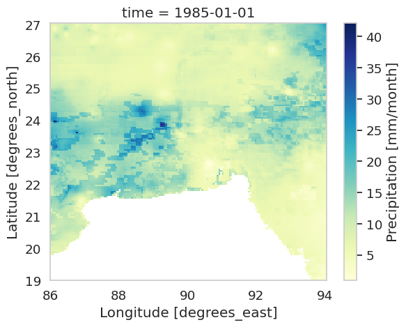
On the output, we can see a precipitation map covering latitude 19°–27° and longitude 86°–94°. Since we only care about Bangladesh, we’ll soon clip the data.
Loading the Bangladesh Shapefile
We load the shapefile using GeoPandas, which is a common library for handling vector spatial data.
import geopandas as gpd

shapefile = '/content/drive/MyDrive/rainfall/shapefiles/bgd_admbnda_adm1_bbs_20201113.shp'
bd = gpd.read_file(shapefile)
bd| Shape_Leng | Shape_Area | ADM1_EN | ADM1_PCODE | ADM1_REF | ADM1ALT1EN | ADM1ALT2EN | ADM0_EN | ADM0_PCODE | date | validOn | validTo | geometry | |
|---|---|---|---|---|---|---|---|---|---|---|---|---|---|
| 0 | 25.424604 | 0.889395 | Barisal | BD10 | None | None | None | Bangladesh | BD | 2015-01-01 | 2020-11-13 | NaT | MULTIPOLYGON… |
| 1 | 30.287321 | 2.737796 | Chittagong | BD20 | None | None | None | Bangladesh | BD | 2015-01-01 | 2020-11-13 | NaT | MULTIPOLYGON… |
| 2 | 12.197758 | 1.806506 | Dhaka | BD30 | None | None | None | Bangladesh | BD | 2015-01-01 | 2020-11-13 | NaT | MULTIPOLYGON… |
| 3 | 38.409385 | 1.826575 | Khulna | BD40 | None | None | None | Bangladesh | BD | 2015-01-01 | 2020-11-13 | NaT | MULTIPOLYGON… |
| 4 | 8.166577 | 0.941812 | Mymensingh | BD45 | None | None | None | Bangladesh | BD | 2015-01-01 | 2020-11-13 | NaT | POLYGON… |
| 5 | 8.410221 | 1.624856 | Rajshahi | BD50 | None | None | None | Bangladesh | BD | 2015-01-01 | 2020-11-13 | NaT | POLYGON… |
| 6 | 15.369683 | 1.465681 | Rangpur | BD55 | None | None | None | Bangladesh | BD | 2015-01-01 | 2020-11-13 | NaT | MULTIPOLYGON… |
| 7 | 9.800293 | 1.103963 | Sylhet | BD60 | None | None | None | Bangladesh | BD | 2015-01-01 | 2020-11-13 | NaT | MULTIPOLYGON… |
On the output, we can see a lot of columns that are unnecessary to us. We only want to store the division names which seems to be in a column named ADM1_EN. We drop unnecessary columns and rename the column that stores division names.
bd.drop(columns=['Shape_Leng', 'Shape_Area', 'ADM1_PCODE', 'ADM1_REF',
       'ADM1ALT1EN', 'ADM1ALT2EN', 'ADM0_EN', 'ADM0_PCODE', 'date', 'validOn',
       'validTo'],inplace=True)

bd = bd.rename(columns={'ADM1_EN':'Division'})
bd| Division | geometry | |
|---|---|---|
| 0 | Barisal | MULTIPOLYGON… |
| 1 | Chittagong | MULTIPOLYGON… |
| 2 | Dhaka | MULTIPOLYGON… |
| 3 | Khulna | MULTIPOLYGON… |
| 4 | Mymensingh | POLYGON… |
| 5 | Rajshahi | POLYGON… |
| 6 | Rangpur | MULTIPOLYGON… |
| 7 | Sylhet | MULTIPOLYGON… |
Looks clean! We can now visualize it:
bd.plot()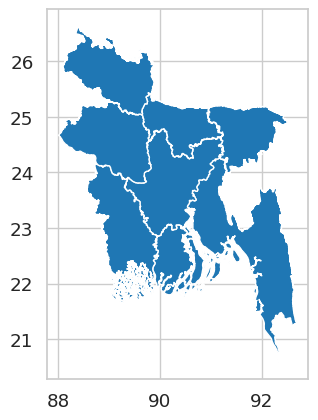
Clipping the Rainfall Data to Bangladesh
To clip raster data using a shapefile, we install the library rioxarray, which adds GIS-like operations to xarray. rioxarray isn’t available in Colab by default, so, we need to install with this command:
!pip install rioxarrayNow we configure the spatial dimensions so rioxarray can understand them:
import rioxarray

rainfall.rio.set_spatial_dims(x_dim="longitude", y_dim="latitude", inplace=True)
We also assign the correct coordinate reference system (WGS 84):
rainfall.rio.write_crs("epsg:4326", inplace=True)Now we clip our rainfall data raster using the Bangladesh shapefile boundary and view the clipped dataset:
bd_rainfall = rainfall.rio.clip(bd.geometry)
bd_rainfall = bd_rainfall.drop_vars('spatial_ref')

import matplotlib.pyplot as plt

plt.figure(figsize=(7,8))
bd_rainfall['precip'].isel(time=0).plot(cmap='YlGnBu')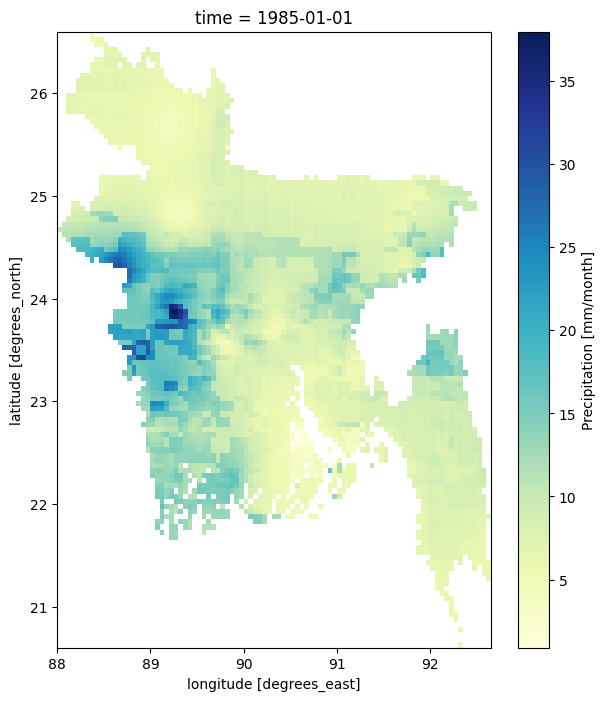
Now the dataset contains only rainfall values inside Bangladesh.
Plotting the data of a specific month
The dataset spans several decades, so we can extract data for any year and month within that.
Example: Rainfall in the month of March (third month in the dataset) of year 2000:
plt.figure(figsize=(7,8))
bd_rainfall.sel(time=rainfall['time'].dt.year == 2000)['precip'].isel(time=2).plot(cmap='YlGnBu')
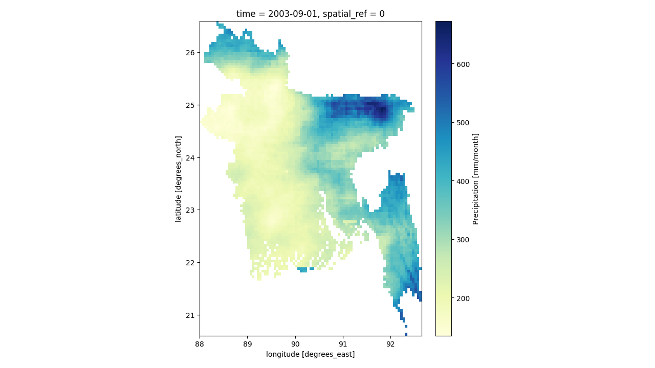
If we look at the code, specifically the line bd_rainfall.sel(time=rainfall['time'].dt.year == 2000)['precip'].isel(time=2).plot(cmap='YlGnBu'), you can see that we’re using .sel() to select the year like this: .sel(time=rainfall['time'].dt.year == 2000) where 2000 is the year and we’re selecting the third month using .isel() like this: .isel(time=2) where 2 is the number of the month (month is counted from 0 or it is zero-indexed, so, 2 selects the third month). I think you can guess how we can plot the data for September 2003:
plt.figure(figsize=(7,8))
bd_rainfall.sel(time=rainfall['time'].dt.year == 2003)['precip'].isel(time=8).plot(cmap='YlGnBu')
Creating a Function to Visualize All 12 Months
Let’s now create a larger plot that contains all 12 months of a year (2000).
year = bd_rainfall.sel(time=rainfall['time'].dt.year == 2000)
fig = plt.figure(figsize=(25, 20),dpi=500)
plt.suptitle('Monthly Mean Rainfall of 2000.',y=0.93,fontsize=30)

gs = fig.add_gridspec(3, 4, hspace=0.15, wspace=0.1)
(ax1, ax2,ax3, ax4),(ax5,ax6,ax7, ax8),(ax9, ax10,ax11,ax12) = gs.subplots(sharex='col', sharey='row')
axes = [ax1, ax2,ax3, ax4,ax5,ax6,ax7, ax8,ax9, ax10,ax11,ax12]

for i in range(12):
    c = axes[i].contourf(year['precip'].isel(time=i),cmap='YlGnBu')
    axes[i].set_title(i,fontsize=12)
    fig.colorbar(c, ax=axes[i], orientation='vertical', fraction=0.1, pad=0.05)
This code block is quite a complex, so, here’s a line-by-line explanation:
On the first line year = bd_rainfall.sel(time=rainfall['time'].dt.year == 2000), we’re selecting the rainfall data for the year 2000 and storing it in the variable year.
We can make it a bit nicer by adding the month names to the plots:
months = ["January","February","March", "April","May","June",
          "July","August", "September","October","November","December"]

year = bd_rainfall.sel(time=rainfall['time'].dt.year == 2000)
fig = plt.figure(figsize=(25, 20),dpi=500)
plt.suptitle('Monthly Mean Rainfall of 2000.',y=0.93,fontsize=30)

gs = fig.add_gridspec(3, 4, hspace=0.15, wspace=0.1)
(ax1, ax2,ax3, ax4),(ax5,ax6,ax7, ax8),(ax9, ax10,ax11,ax12) = gs.subplots(sharex='col', sharey='row')
axes = [ax1, ax2,ax3, ax4,ax5,ax6,ax7, ax8,ax9, ax10,ax11,ax12]

for i in range(12):
    c = axes[i].contourf(year['precip'].isel(time=i),cmap='YlGnBu')
    axes[i].set_title(f'{months[i]}',fontsize=12)
    fig.colorbar(c, ax=axes[i], orientation='vertical', fraction=0.1, pad=0.05)
Conclusion
You have now learned how to:
- load vector and raster geospatial data in Python
- visualize climate data stored in NetCDF format
- clip a global dataset to a region of interest using a shapefile
- explore rainfall variation across space and time
- generate a series of maps programmatically
From here, you can compute long-term averages, seasonal trends, anomalies, or even build animations. Python gives you complete control over your workflow – while keeping everything reproducible and transparent. In the next articles of this series, we’ll learn how we can create charts, calculate rainfall anomaly, calculate and plot Standardized Precipitation Index (SPI).
Leave a Reply